The UWP > Dashboard Menu block is used to display the UsersWP dashboard navigation menu on the frontend. It allows users to easily access different dashboard sections such as profile, listings, payments, and settings.
This block appears on the user dashboard page.
Content Settings
Below are the available content settings for the UWP > Dashboard Menu block:
- Hide Menu Text – Enable this option to hide the text labels of menu items.
- Hide Menu Icon – Enable this option to hide the icons of menu items.
- Menu Icon Position – Select the position of the menu icon. Available options include Left (Default), Right, and Top.
Style Settings
Below are the available style options for the UWP > Dashboard Menu block:
- Navigation Layout – Choose how the navigation menu is aligned. Available options include Default (Left), Center, Left, Right, Justified (Equal Width), Justified (Default Width), and Vertical.
- Navigation Style – Select the visual style of the menu. Available options include Default (Link), Pills, and Tabs.
Advanced Settings
The advanced section allows you to customize the appearance of the dashboard menu using custom styles.
- Margin – Adjust the spacing around the dashboard menu.
- Background Color – Set a custom background color for the menu.
- Border Color – Define the border color of the dashboard menu.
These advanced options help you match the dashboard menu design with your website theme.
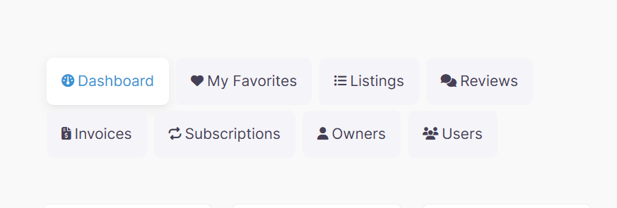
Example Output
Below is an example of how the dashboard menu appears on the frontend with default settings applied:
Default Output:
The appearance and layout may vary depending on your active theme and customization settings.